
WELCOME
I hope you enjoy reading this project as much as I enjoyed doing it.
FreshYo: Fresh Food For You!
A UI/UX case study.
Timeline
16th-30th September 2024
Platform
Android
Tools
Figma, google forms, Canva
Overview
In this two-week-long Project, I worked as the lead UX researcher and designer from conception to delivery to design an app that allows users shop grocery items online easily
My Responsibilities
I was the UX designer responsible for the entirety of the project; from conception to delivery.
-
Conducting interviews
-
Competitive audits
-
Creating proper and digital wireframes
-
Designing low and high fidelity prototyping
-
Conducting usability studies
-
Design Iteration
Understanding Users
I conducted interviews to understand the users and their needs. My primary user group was adults between the ages of 18-70 year olds, who shop. This user group confirmed initial assumptions about FreshYo's customers and their lack of time but research revealed that time was not the only factor that made up their painpoints. Other user problems included:
Pain Points we identified after the first round of research:
Time
-
Too many people at the store at once
Comfort
-
Slower checkout.
-
Need help with picking/shopping items
-
items at different parts of the store
Defining the Problem
After Identifying pain points, I defined the problem with "how might we" statements.
How might we help users to conveniently shop easier and quicker?
Our Users
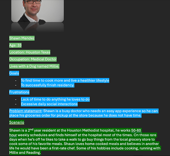
Based on the results of the primary research I created a persona to represent one type of user by highlighting their goals, frustrations and needs.
User Personas
User Journey Map
Mapping Shawn's user journey revealed how helpful it will be for users to have access to the hospital app that helps them check in before any appointment.
Goal Statement
Our App will let users shop and find products in real time, it will affect customers of the local grocery store by letting users search for product, reserve them and buying them for pickup in store thereby saving them time.
We will measure effectiveness by tracking the average amount of time a customer spends shopping.
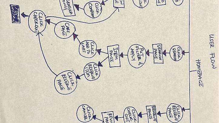
Process
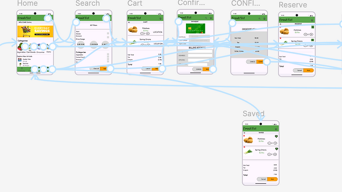
Before starting to design, I had to create the user flow for the app.
User Flow
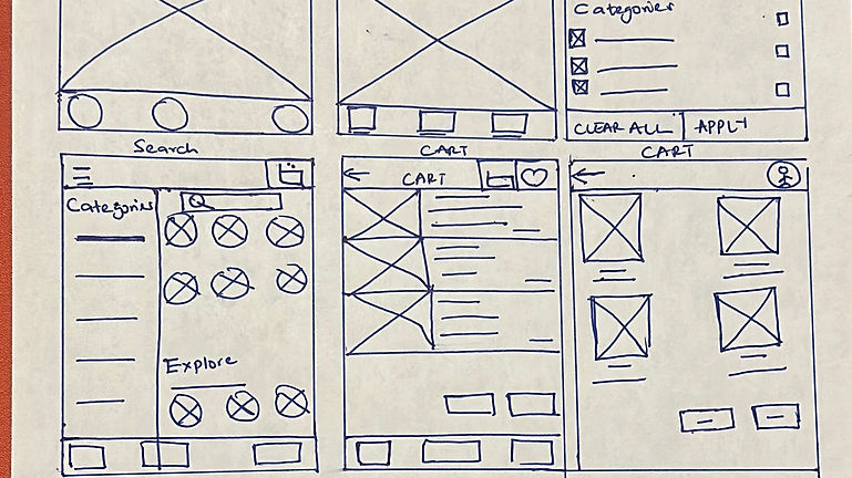
Sketches
I came up with ideas for the app that specifically targets the users pain points. I did different variations making sure that the pages that would get to the digital wireframe phase efficiently addresses the gap from the competitive audit and user pain point.
Low-Fi Prototype
After drafting so many variations of pages of the paper wireframes, I created the initial design for the iHealth app. These designs focus on offering check in options as well as providing health screening questions to help users communicate their health status and the reason for the visit.
Low-fi-Digital wireframe-Homepage
Low-fi-Digital wireframe-Cart Page
Low-fi-Digital wireframe- Reservation Page

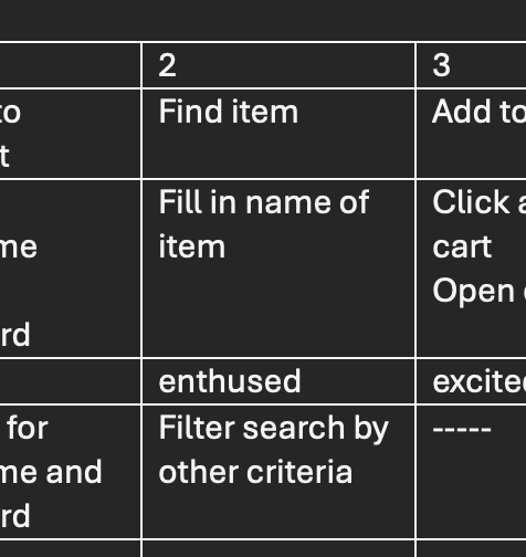
Research Plan
The first round of usability testing was conducted after the low-fidelity Prototype phase of the design to understand what real users think about the design, whether it was clear and cohesive when completing tasks.
Project Background: Creating an efficient means of online shopping; where users can find quantity available and reserve items that are almost out of stock, place order for pick up in store.
Research Goals: To figure out if indeed time is saved shopping online with the reservation option the app offers.
Research Questions:
-
How do you like the reservation option? does it aid comfortable shopping?.
-
What's your general feeling about the app? What did you like versus what did you dislike?
Research Methodology
-
Unmoderated Usability study
-
Location: United States, Remote
-
Date: Session took place September 5th and 6th 2024
-
5 Participants went through the app on their own, a questionnaire was provided for each participant after the session.
-
Each session lasted 30 minutes
Participants
-
People who live in the Fort Bend district
-
Adults capable of shopping for the home.
-
2 Male, 2 Female, 1 non-binary
-
Incentive: $25 amazon gift card.
First Usability Testing
The Usability study answered the following questions:
-
How do you like the reservation option? how does it aid comfortable shopping?.
-
What's your general feeling about the app? What did you like versus what did you dislike?
These were the common themes from our findings.
Poor flow
-
Users wanted the app to be less monotonous.
-
Users Pointed out that home page needed more cohesion and clarity.
Confusion
-
Many buttons performing the same functions
-
Confusion with the flow in completing shopping task.
Design
-
Brand identity infusion.
Low-fi-Digital Prototype-Homepage
Low-fi-Digital Prototype-Check in Page
Low-fi-Digital Prototype- Health Screening Page

Second Usability Testing
The Second round of usability testing was conducted after the low-fidelity wireframe phase of the design to understand what real users think about the design, whether it was easy to use and understand when completing tasks.
The Usability study answered the following questions:
-
Is the app processes clear
-
What's your general feeling about the app? What did you like versus what did you dislike?
These were the common themes from our findings.
Design
-
Users found text smaller and interaction less engaging
Design
-
Users want a
Ease
-
Users pointed out that an easier way to search for products will improve experience.
Final Designs
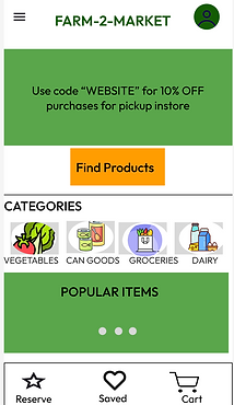
Before Usability Studies- Homepage
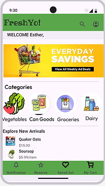
After Usability Studies- Homepage
-
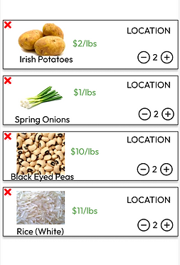
Final design also looks more cohesive and visually appealing. Instead of the "find Products" it uses the search icon to help users quickly search the app.
-
It offers a navigation tab for users to get quick access to the app's other functionalities.
-
The "SAVED" option is for users to save regular order for faster checkout in the future.
-
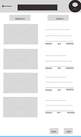
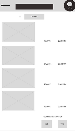
The "RESERVE" option is for users to reserve items that are limited in quantity in the store before others buy it all out.
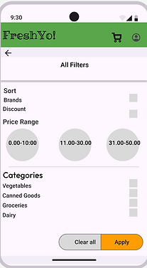
-
Final design provides an option to return to homepage and a button that ensures that the "clear all" button does not automatically take you back to homepage, instead giving you an opportunity to do it again.
-
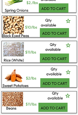
This design allows users to filter by and search for items by brands, discount available, category or price.
Before Usability Studies- Health Screen Page
After Usability Studies- Health Screen Page
Before Usability Studies- Check-In Page
After Usability Studies- Check-In Page

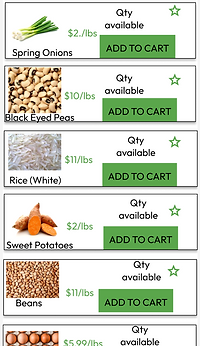
-
Final design provides is more cohesive and clear.
-
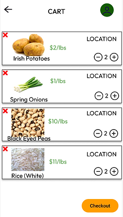
It also offers ability to scroll down to accommodate long orders.
-
It also calculates the price of items so users know total amount due for items before getting to payment review page
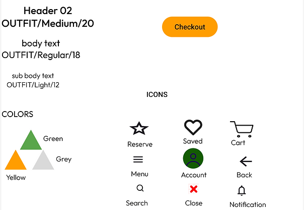
Design Guide
The High Fidelity Prototype
Accessibility Considerations
Used Icons to help make navigation easier.
Lessons Learned
In the course of this project I learnt the importance of the right research questions; how it shapes the quality of feedback you get from research participants which in turn influences the quality of design for your app.
Next Steps
-
Conduct another round of usability studies to validate whether the pain points users expressed have been effectively addressed.
-
Conduct more research to determine any new areas of need.