
WELCOME
I hope you enjoy reading this project as much as I enjoyed doing and compiling it.
MaiHealth : Make every visit easy breezy
A UI/UX case study.
Timeline
1-30th September 2024
Platform
Android
Tools
Figma, google forms, Canva
Overview
In this one-month-long Project, I worked as the lead UX researcher and designer from conception to delivery to design an app that allows users easily check-in when they arrive at the doctor's office as well as answer health screening questions to determine their general health status and the purpose of the visit.
My Responsibilities
I was the UX designer responsible for the entirety of the project; from conception to delivery.
-
Conducting interviews
-
Competitive audits
-
Creating proper and digital wireframes
-
Designing low and high fidelity prototyping
-
Conducting usability studies
-
Design Iteration
Understanding Users
User Characteristics:
-
Adult (18-65)
User Research
I conducted interviews to understand the users and their needs. A primary user group was adults between the ages of 18-65 years old. This user group confirmed initial assumptions about MAIHEALTH's customers and their lack of time but research revealed that time was not the only factor that made up their painpoints. Other user problems included:
Pain Points we identified after the first round of research:
Time
Convenience
Streamlined process
Defining the Problem
After Identifying pain points, I defined the problem with "how might we" statements.
How might we help users to spend less time at the doctors office and ensure smoother process?
Our Users
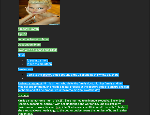
Based on the results of the primary research I created a persona to represent one type of user by highlighting their goals, frustrations and needs.
User Personas
User Journey Map
Mapping Kim's user journey revealed how helpful it will be for users to have access to the hospital app that helps them check in before any appointment.

Goal Statement
The goal is to create a structured check-in process for patients and provide the doctor with a general idea as to the health status of the patient through the Health Screening questions.
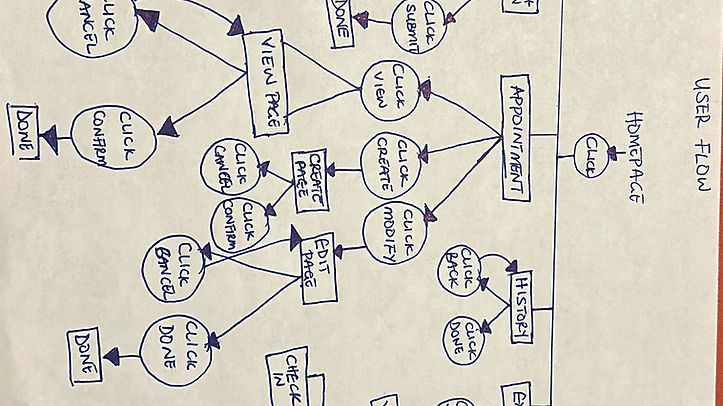
Process
Before starting to design, I had to create the user flow for the app.
User Flow
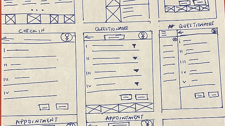
Sketches
I came up with ideas for the app that specifically targets the users pain points. I did different variations making sure that the pages that would get to the digital wireframe phase efficiently addresses the gap from the competitive audit and user pain point.
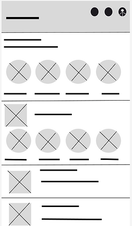
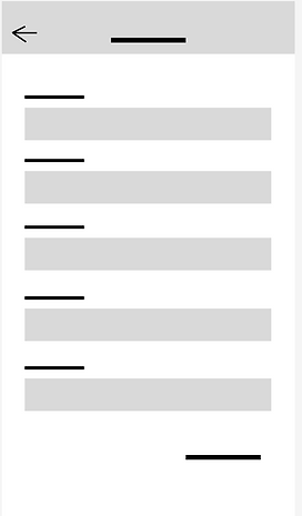
Low-Fi Prototype
After drafting so many variations of pages of the paper wireframes, I created the initial design for the iHealth app. These designs focus on offering check in options as well as providing health screening questions to help users communicate their health status and the reason for the visit.
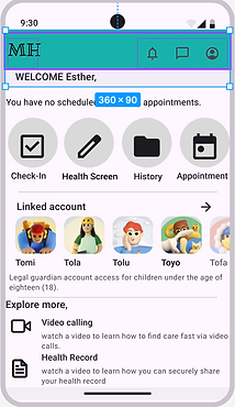
Low-fi-Digital wireframe-Homepage
Low-fi-Digital wireframe-Check in Page
Low-fi-Digital wireframe- Health Screening Page
Research Plan
The first round of usability testing was conducted after the low-fidelity Prototype phase of the design to understand what real users think about the design, whether it was clear and cohesive when completing tasks.
Project Background: Creating an efficient means of online shopping; where users can find quantity available and reserve items that are almost out of stock, place order for pick up in store.
Research Goals: To figure out if indeed time is saved shopping online with the reservation option the app offers.
Research Questions:
-
What's your general feeling about the app? What did you like versus what did you dislike?
Research Methodology
-
Unmoderated Usability study
-
Location: United States, Remote
-
Date: Session took place September 12th and 15th 2024
-
5 Participants went through the app on their own, a questionnaire was provided for each participant after the session.
-
Each session lasted 30 minutes
Participants
-
People who live in the Fort Bend district
-
Adults capable of shopping for the home.
-
2 Male, 2 Female, 1 non-binary
-
Incentive: $25 amazon gift card.
First Usability Testing
The Usability study answered the following questions:
-
Is the app processes clear?
-
What's your general feeling about the app? What did you like versus what did you dislike?
These were the common themes from our findings.
Design
-
Users Pointed out that home page needed more cohesion and clarity.
Ease
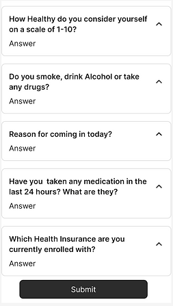
Users wanted a Dropdown option to give a general idea of data required in the health screening page.
Design
-
Brand identity infusion.
-
Users Pointed out that home page needed more cohesion and clarity.
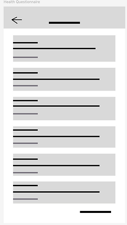
Low-fi-Digital Prototype-Homepage
Low-fi-Digital Prototype-Check in Page
Low-fi-Digital Prototype- Health Screening Page
Second Usability Testing
The Second round of usability testing was conducted after the low-fidelity wireframe phase of the design to understand what real users think about the design, whether it was easy to use and understand when completing tasks.
The Usability study answered the following questions:
-
Is the app easy to use to check-in?
-
Are customers able to use the screening questions page?
-
What's your general feeling about the app? What did you like versus what did you dislike?
These were the common themes from our findings.
Convenience
-
Users wanted a cancel option to disable all previously entered data on the questionnaire.
Design
-
Users found text smaller and interaction less engaginga
Design
-
Users called out preferring a search option button to find preferred doctors.
Final Designs
Before Usability Studies- Homepage
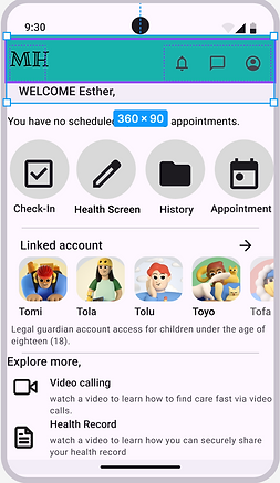
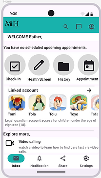
After Usability Studies- Homepage
-
Early designs didn't allow for customization but after the second usability studies, the design allows users to filter by and search for preferred doctor as well as search the entire app.
-
Final design also offers a navigation tab for users to get quick access to the app's other functionalities.
-
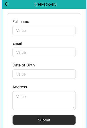
Final design provides an option to return to homepage and a button that ensures clearing out questionnaire answers does not automatically take you back to homepage, instead giving you a blank questionnaire for an opportunity to retype.
-
It also offers a navigation tab for users to get quick access to the app's other functionalities.
-
It also offers ability to scroll down to accommodate long answers.
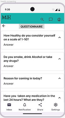
Before Usability Studies- Health Screen Page
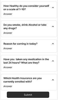
After Usability Studies- Health Screen Page
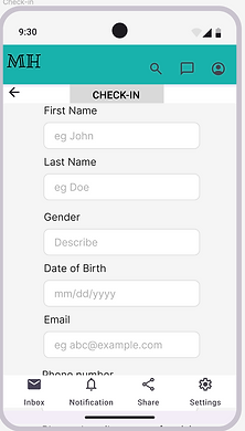
Before Usability Studies- Check-In Page

After Usability Studies- Check-In Page
-
Final design provides is more cohesive and clear. It provides placeholder texts to help improve user experience with the app.
-
It also offers a navigation tab for users to get quick access to the app's other functionalities.
-
It also offers ability to scroll down to accommodate long answers.
Design Guide
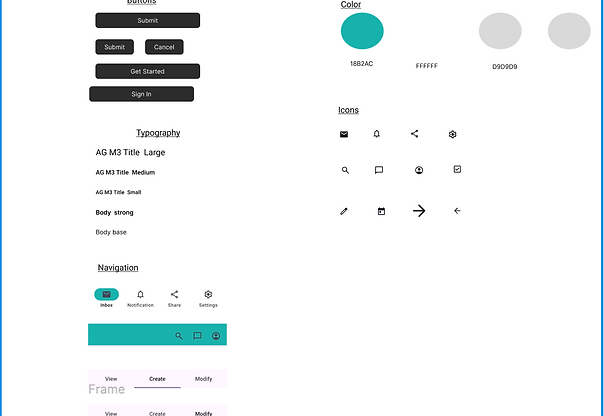
The High Fidelity Prototype

Accessibility Considerations
Used Icons to help make navigation easier.
Used detailed imagery for easy understanding
Lessons Learned
In the course of this project I learnt the importance of the right research questions; how it shapes the quality of feedback you get from research participants which in turn influences the quality of design for your app.
Next Steps
-
Conduct another round of usability studies to validate whether the pain points users expressed have been effectively addressed.
-
Conduct more research to determine any new areas of need.